BRAND
Guidelines
Our Legacy Logo
We’ve refined our Semester At Sea logo to enhance its simplicity and impact. Today, the handwritten text styling is preventing variations of our logo that support its flexible use, leading it to feel more like a design element than an anchoring design feature.
Our goal is for our logo to carry more visual weight, feel structured and appear more grounded. This shift maintains the core elements of our emblem, honoring its original design intent, but streamlines the design for a more modern and sophisticated look.
Our Logos
The typographic update to our logo shifts hand-drawn text to a tall sans-serif that will be the grounding typeface for the brand. With this shift, we have introduced a horizontal variation of our logo to create the necessary variety needed in logo formats for different design use cases.
Additionally, we have introduced a more “in the know” logo variant that serves as a monogram logo for Semester At Sea: SAS. A term that colloquially and in text is often used as Semester At Sea shorthand. The goal of this to lean into and create ownership around a natural tendency.
While our primary logos are to be utilized freely, our SAS monogram logo should only be used colloquially—this means that students already familiar with the brand may see this logo on merch, or other “insider” materials, but it should never be used externally or for marketing collateral.
One Color
When printing limitations prevent the use of multiple colors, or when the medium only supports a single ink, we provide a streamlined logo version that maintains our brand’s integrity—it’s essential to have a single color logo for this use. To ensure clarity and legibility in this format, the wave element is strategically removed from the letters. This separation allows the logo to remain distinct and recognizable, even in its most minimal form.
This one-color variant of the Semester at Sea logo is designed to meet the technical requirements of these situations, however it should not be used if not technically necessary.
Please note that this one-color logo variant is exclusively used for materials requiring one-ink printing. For all other applications, the standard multi-color logo should be used to fully represent our brand identity
Safe Space
Horizontal Logo
Safe space refers to the clear area around the logo that prevents overcrowding and ensures the logo stands out prominently. This space is crucial for maintaining the logo’s legibility and visual integrity, especially when used in various layouts and sizes.
1. Minimum safe space:
Always keep a clear area around the logo that is at least two waves. This space helps the logo breathe and ensures it remains easily identifiable.
2. Consistency:
Apply this rule consistently across all applications, including digital and print materials, to maintain a cohesive brand appearance.
3. Adaptive use:
Whether scaling the logo up or down, adjust the safe space proportionally to maintain the integrity of the logo’s presentation.
The logo wave will be used as the measurement to calculate the safe space for all our logos. When being used for measurement it should be at the same scale as presented in the logo. This consistent distance ensures that the logo has adequate breathing room and maintains its visual integrity across all applications.
Safe Space
Vertical Logo
Safe space refers to the clear area around the logo that prevents overcrowding and ensures the logo stands out prominently. This space is crucial for maintaining the logo’s legibility and visual integrity, especially when used in various layouts and sizes.
1. Minimum safe space:
Always keep a clear area around the logo that is at least two waves. This space helps the logo breathe and ensures it remains easily identifiable.
2. Consistency:
Apply this rule consistently across all applications, including digital and print materials, to maintain a cohesive brand appearance.
3. Adaptive use:
Whether scaling the logo up or down, adjust the safe space proportionally to maintain the integrity of the logo’s presentation.
The logo wave will be used as the measurement to calculate the safe space for all our logos. When being used for measurement it should be at the same scale as presented in the logo. This consistent distance ensures that the logo has adequate breathing room and maintains its visual integrity across all applications.
Safe Space
SAS Logo
Safe space refers to the clear area around the logo that prevents overcrowding and ensures the logo stands out prominently. This space is crucial for maintaining the logo’s legibility and visual integrity, especially when used in various layouts and sizes.
1. Minimum safe space:
Always keep a clear area around the logo that is at least two waves. This space helps the logo breathe and ensures it remains easily identifiable.
2. Consistency:
Apply this rule consistently across all applications, including digital and print materials, to maintain a cohesive brand appearance.
3. Adaptive use:
Whether scaling the logo up or down, adjust the safe space proportionally to maintain the integrity of the logo’s presentation.
The logo wave will be used as the measurement to calculate the safe space for all our logos. When being used for measurement it should be at the same scale as presented in the logo. This consistent distance ensures that the logo has adequate breathing room and maintains its visual integrity across all applications.
Applications
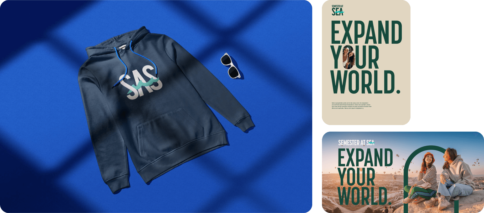
Color Combination
Our logo is a vital element of our brand identity, and its design is carefully crafted to complement our color palette. Central to this is the wave, which is always presented in either teal or white, depending on the background for optimal visibility and brand consistency.
The wave’s adaptability in these two colors allows it to seamlessly integrate with our broader color scheme, ensuring that our logo remains visually cohesive across all applications. Whether placed on a vibrant background or a more subdued tone, the wave in teal or white ensures that our logo stands out and remains instantly recognizable.
Below are examples of how the logo interacts with various colors in our palette. They demonstrate the versatility and consistent look of our logo, highlighting the importance of using the designated colors to maintain our brand’s visual integrity.
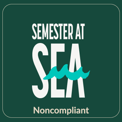
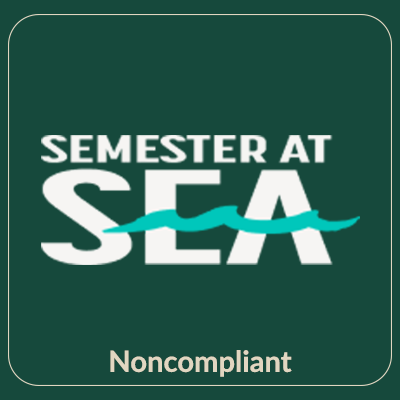
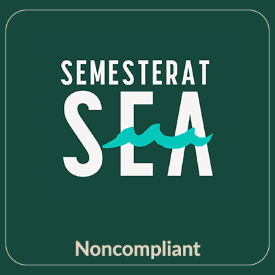
Don’ts
Please note that all guidelines in the “Don’ts” section apply to every version of our logo. It’s crucial to carefully review this section before using any logo variant to ensure consistency and adherence to our brand standards.
Our Brand Icon
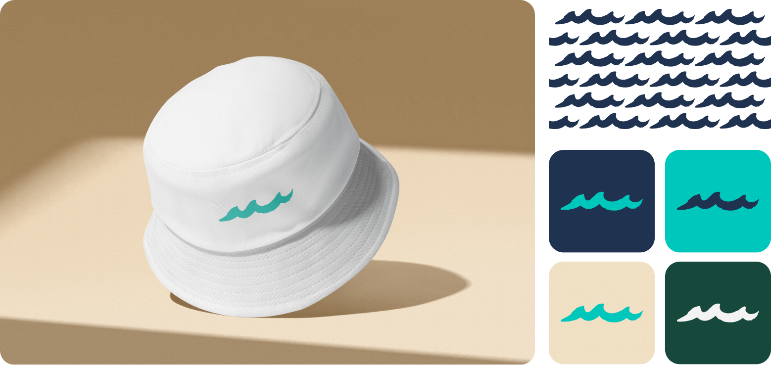
Our brand icon for Semester At Sea is the extracted wave from our logo. This design element is versatile and can be used in all our brand colors, adding a unique touch to our swag and design highlights.
While our brand icon a distinctive flair to our branding, it is important to note that it will never replace our main logos. Instead, it serves as a complementary detail, enhancing and reinforcing our visual identity.
The brand icon is designed to be a subtle yet impactful element, always working alongside our primary logo to create a cohesive and recognizable brand presence.
Applications
Don’ts
Our Brand Colors
Our color palette is an interpreted balance of land and sea. The deep navy and rich teal represent the vastness and depth of the sea, grounding our identity in the maritime journey that
defines Semester at Sea, while the dark green and sand represent the land explored throughout a voyage.